
Politicians and the media are usually measuring the effects of the COVID-19 disease pandemic, caused by a coronavirus, by the number of positive cases detected, either the day before, or in the previous 14 days (number of cases per 100,000).
I believe that this is a mistake, as it makes it very difficult to make comparisons along the evolution of the pandemic, for the number of positive cases detected clearly depends on the number of tests carried out (the more tests, more positive cases will be detected), and since the number of tests carried out varies constantly, the data they provide cannot be compared.
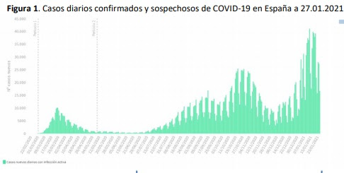
Let's look at the data given over time by the
Spanish ministry of Health. Figure 1 corresponds to the year 2020:

An attempt has been made to use the number
of hospitalizations or the number of admissions to ICU as an element of
comparison. At first glance, it seems logical, although there are also
important differences over time, such as the progressive administration of
vaccines, which seems to reduce a lot the number of hospitalizations (Figure 3
shows data from the USA):


One interesting piece of information is
the number of deaths due to vaccination, without having suffered from the
disease. As I said in another
post, I was on the verge of being one of those victims. I know of cases
where deaths have occurred. These data are available for the United States. At
the beginning of June, the number of deaths attributable to the vaccine was 25,800.
Since, by then, about 150 million people had been vaccinated, the risk of death
from vaccination was about 0.02%. In contrast, the number of deaths from COVID by
that date in the United States reached 600,000 out of 33 million infected.
Therefore, the risk of death by the disease was about 2%. I think it’s clear that
it is better to get vaccinated, unless there are medical contraindications, for
the risk turns out to be a hundred times lower than that of dying from the
disease.
Thematic Thread about Medicine: Previous Next
Manuel Alfonseca
No comments:
Post a Comment