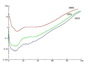
Almost eight years ago I wrote a post on this topic in this blog, which contained a figure that I built starting from data provided by the Spanish Institute of Statistics, which showed mortality data for Spain in three different years: 1900, 1991 and 2013. The three curves in the figure represent the percentage of people who have reached a certain age and will die during the next year. I’m showing here an equivalent figure, with updated data that correspond to the years 1900, 1991 and 2022, as we now have more recent data.
As I said then, the figure shows that medical advances have reduced mortality, especially at the beginning and the end of life, but their effects are little noticeable for people between 20 and 40 years old. The mortality curve, which in 1900 was U-shaped, is approaching an inverted L, with a very low rate for almost all of life and a fairly abrupt rise after age 80.
The Spanish data
end at age 100, for after that age there are so few people alive that no
significant statistical consequences can be deduced. In any case, the curve shows
that in 1900 one out of every two centenarians died the following year, but in
2022 the number is one out of every three. This seems to indicate that human
longevity has not changed in millennia. There always have been
centenarians, and there seems to be a maximum limit for the
length of our life, approximately equal to 120 years.
Reading the book The Long and the Short of It: The Science of Lifespan and Aging, by Jonathan Silvertown (2013, University of Chicago Press), has shown me that the curve in the previous figure is even more useful than it seems at first glance. Silvertown states that, if we make the vertical axis logarithmic, what we get is the aging curve for humans. Let's see how the curves look when this change is applied:
These are the
consequences that can be drawn from this change in our point of view:
•
From 20
to 40 years old we age little. In 1900
the mortality curve was almost horizontal. Now it is growing, but at 40 is
still ten times lower than in 1900.
•
Since the
age of 40, the logarithmic mortality curve grows almost linearly, although the distance between the curves decreases
as we approach age 100. This is why Silvertown claims that the curve, shown
this way, represents aging.
The conclusion is
that medical advances have delayed our aging, without modifying longevity.
Consequently, we cannot expect life expectancy to continue increasing as until
now, unless longevity can be increased, which remains to be seen, since so far,
no progress has been made in this field. In fact, a stagnation in life
expectancy was observed in the United States even before the COVID-19 pandemic,
which marked a setback almost everywhere in the world.
Silvertown also
mentions some studies carried out with the few supercentenarians
(over 110 years old) living now in the world. Their number is assumed to be
about 400, although only 45 are known with certainty. At first glance, it seems
that the increase in mortality stops upon reaching that age, at a value
approximately equal to 50%, which coincidentally was what it had at age 100 in
1900. This means that there is a maximum mortality of 50%: if that value is
reached, mortality no longer increases.
Anyway, assume
that there were 400 people aged 110. Their mortality rate is so high that only
200 would reach 111; of these, 100 would turn 112; 50, 113; 25, 114; 12, 115;
6, 116; 3, 117; 1 or 2, 118; 1, 119; and one or none, 120. Which fits with the
idea, expressed above, that our longevity does not exceed 120 years.
Finally, note that
the mortality curve is currently still U-shaped, as in 1900, although such as
it is usually shown, this is not noticeable. Between 15 and 20% of human beings
die before being born, because they are killed in
induced abortions. This is quite similar to the number of
children who died in 1900 for natural causes during their first year of life. Statistically
the situation is similar, ethically much less so.
Thematic thread on Immortality: Preceding Next
Manuel Alfonseca


No comments:
Post a Comment